Homepage
CASE STUDY
MMM Beauty: from fragmented Squarespace + Acuity to a premium website + Square Appointments setup.
MMM Beauty is an independent nail studio in Brackley. The demand was already there, but the website was not turning that demand into clean, confident online bookings. The rebuild focused on one thing: making the site feel as premium as the studio and making the route to book obvious on mobile.
Revenue YoY (Jan–Apr)
+44%
Client visits YoY
+26%
Repeat rate (4 months)
57%
April 2026
Strongest month on record
Source: live Square POS transaction data, Jan–Apr 2025 vs Jan–Apr 2026. Year-on-year visit counts normalised for the deposit-first booking model.
Homepage
The visible problem was fragmented booking behaviour. Visitors would land on the site, browse treatments, then drop into DMs instead of moving through a clean booking flow. That looked like a customer habit problem on the surface, but it was really a website and systems problem.
The existing setup combined a DIY Squarespace site with a separate booking journey, which meant the experience felt split in two. The site did not look premium enough for the quality of the studio, the path to book took too many steps, and mobile performance was slow enough to create hesitation at exactly the wrong moment.
That had a real commercial cost. Booking intent was leaking into manual admin. Instead of the site handling customer action cleanly, Meghan was still dealing with message-based booking requests and avoidable back-and-forth.
The easy option would have been a cosmetic tidy-up on the existing setup, but the real constraint was the fragmented customer journey, not the design, so the answer had to be bigger than a visual refresh.
We treated the project as a booking-led rebuild. The site was restructured around the points where customers decide whether to trust the business and whether to book. Booking calls to action were brought into the places where intent forms, not left buried in one isolated step.
Alongside the rebuild, we tightened the wider trust layer around the business: clearer service presentation, a more premium visual system, stronger local SEO foundations, and a setup Meghan could manage without relying on a developer for routine changes.
What changed in measurable terms.
Booking path
4 screens
2 taps
Pages with above-fold CTA
1 / 6
6 / 6
Avg page weight
~3.2 MB
~890 KB
Mobile-first pages
0 / 6
6 / 6
This was a full platform and conversion-path upgrade, not a reskin.
The new site was built to make the path from browsing to booking shorter, clearer, and faster on mobile. Page structure was rebuilt around a discover, trust, act flow, so visitors understand the services quickly, see proof sooner, and get multiple clear chances to book without friction.
The visual system was also upgraded so the digital experience felt aligned with the in-person experience of the studio. That matters for premium local services. When the site looks underpowered, it quietly drags down the perceived value of the business.
Under the hood, the stack was rebuilt around speed, maintainability, and safer updates. Meghan can manage content through Sanity, Square handles bookings and payments, and automated checks now run across deploys so quality stays consistent over time.
Beyond the booking flow, the site was built with content depth that a single-page brochure cannot match. Fifteen journal articles covering treatments, local beauty advice, and skin education. Individual pages for Banbury, Bicester, Towcester, and Buckingham with local FAQs and most-booked services per town. Structured data on every treatment page. That content depth, not the redesign alone, is what gives the site its local search presence.
Every page rebuilt around one job: help people decide and book.
Built mobile-first with dark and light mode that just works.
More places to book, fewer places to lose people.
Meghan can update treatments and content in under 5 minutes, no developer needed.
Modern stack with automated checks so things don't break when we ship updates.
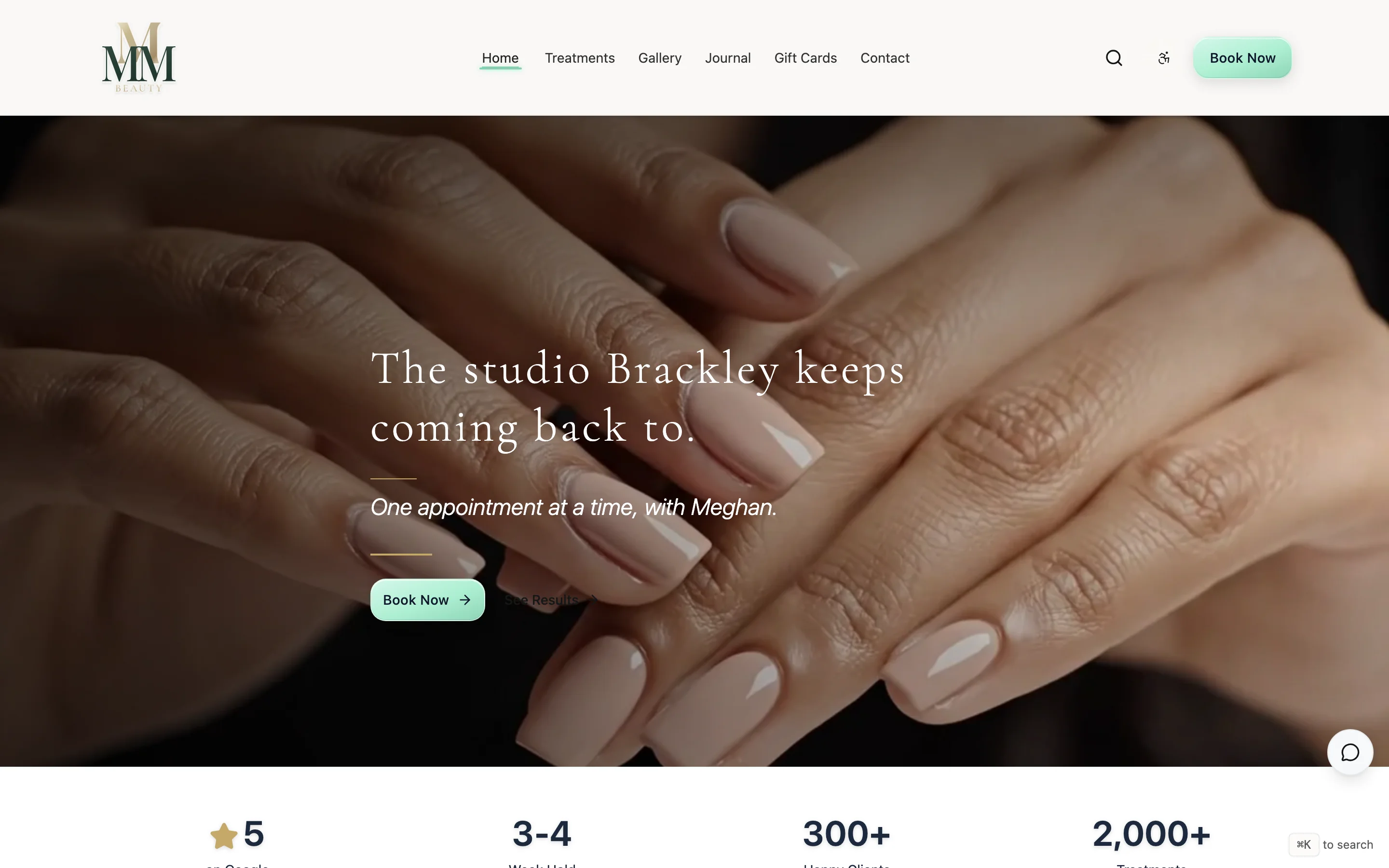
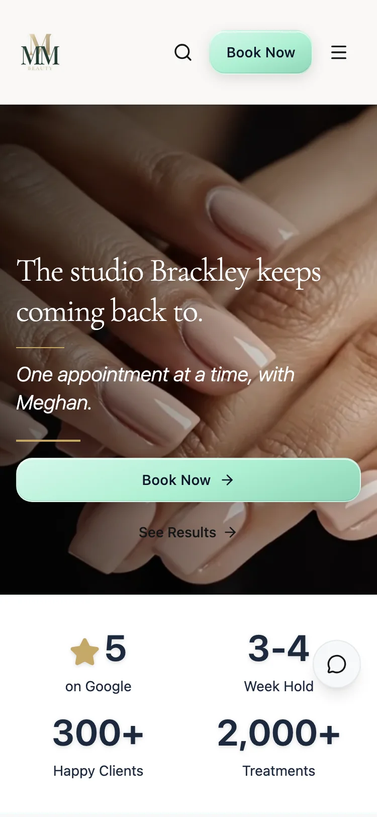
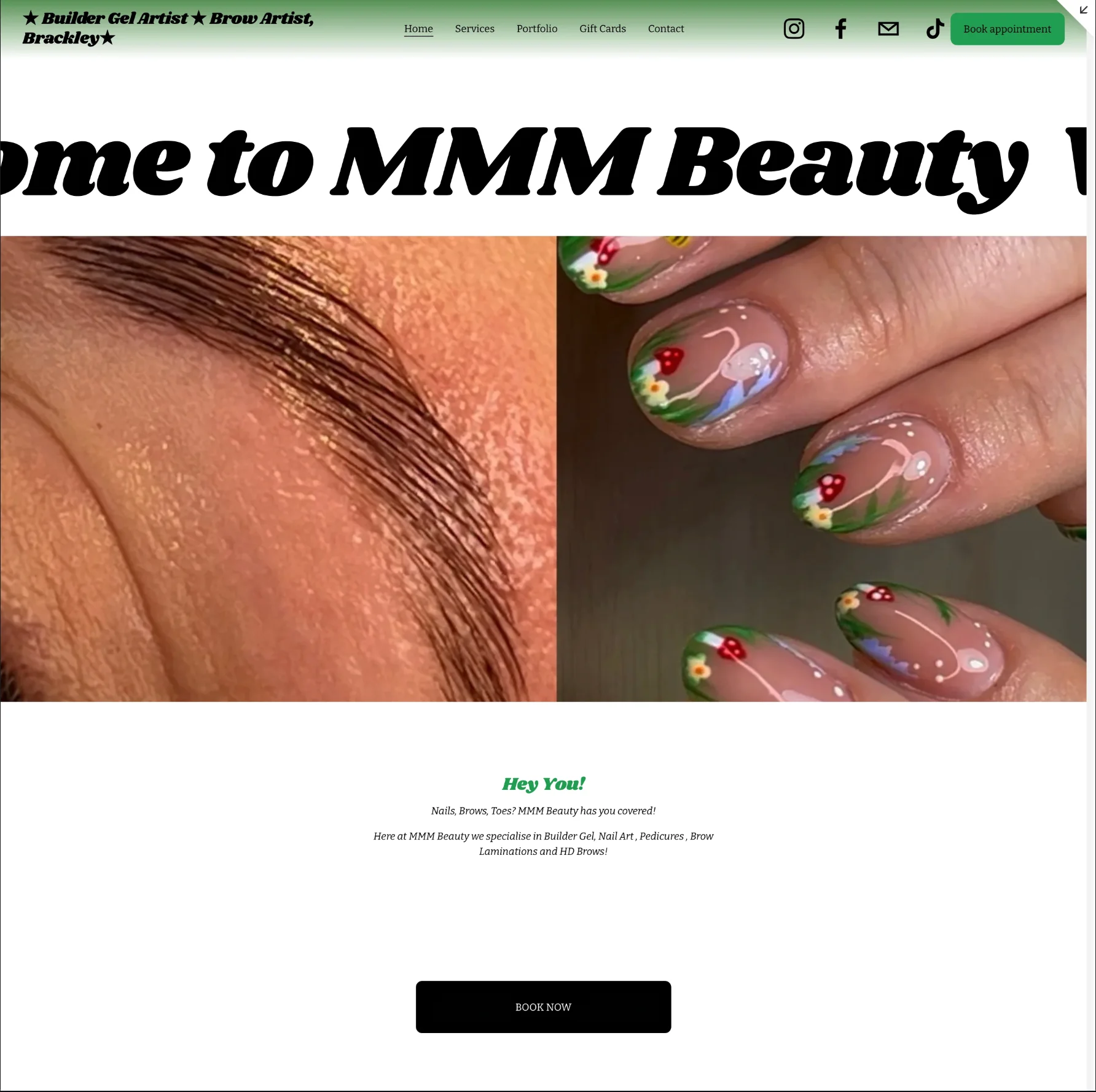
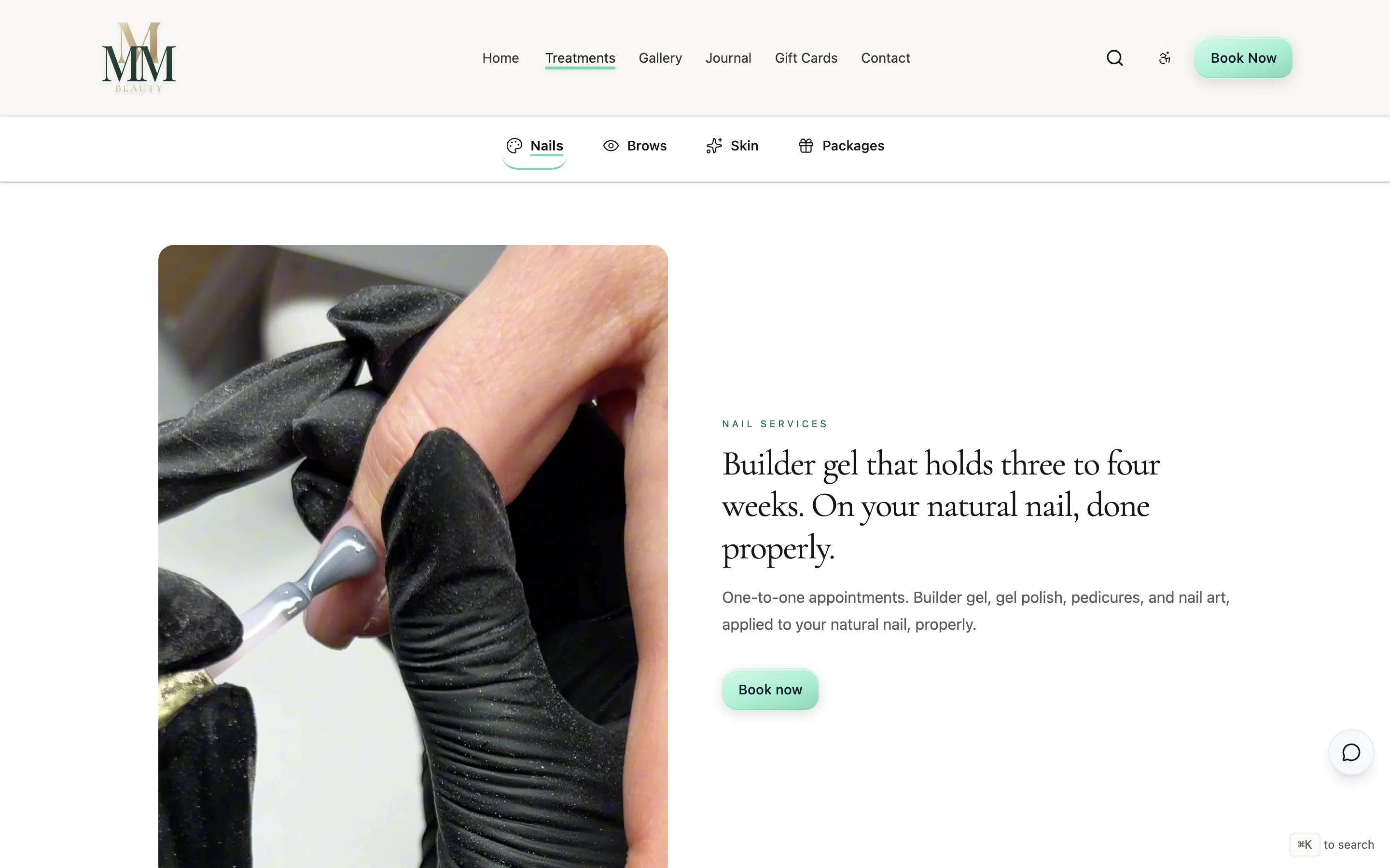
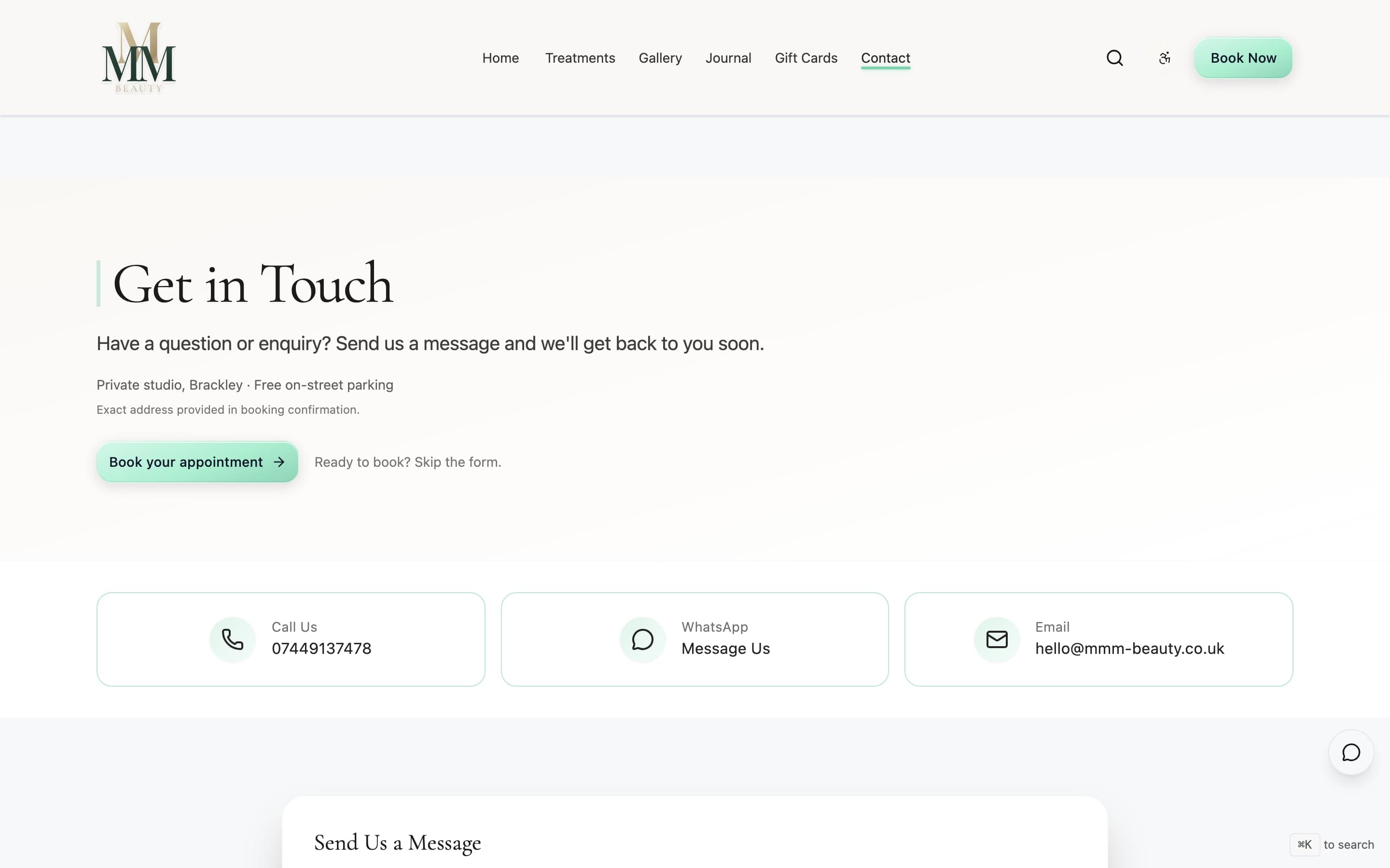
Before: Stock banner, no booking button above the fold, link buried in the nav.
After: Real hero image, "Book Now" visible straight away, trust strip with reviews underneath.
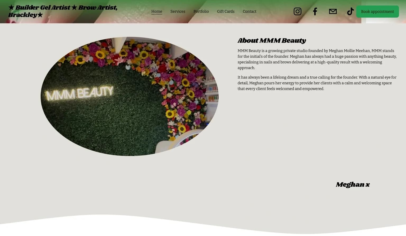
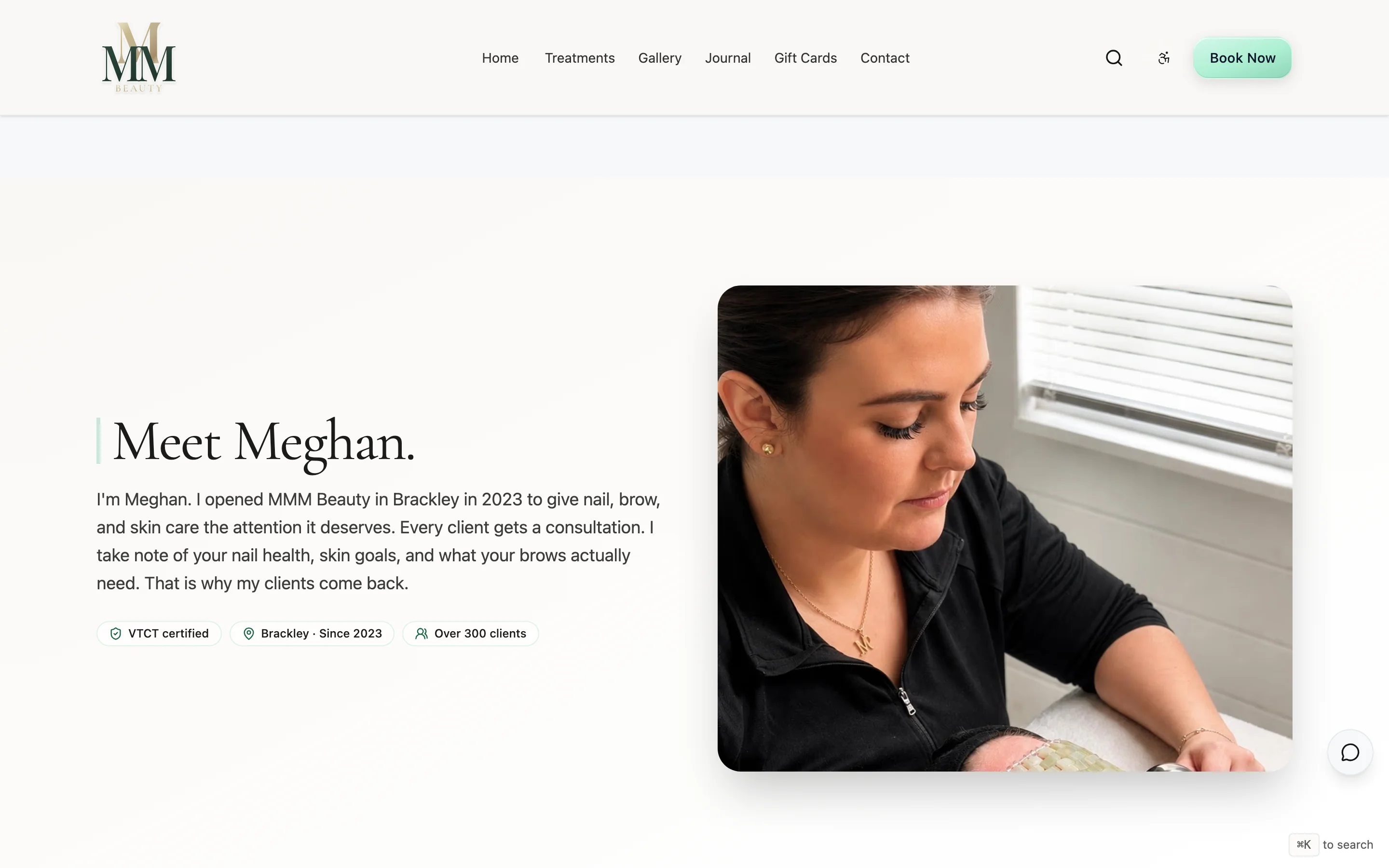
Before: The team and story were barely shown. No reviews, no next step.
After: Proper about page with trust signals, the team front and centre, and a clear booking prompt.
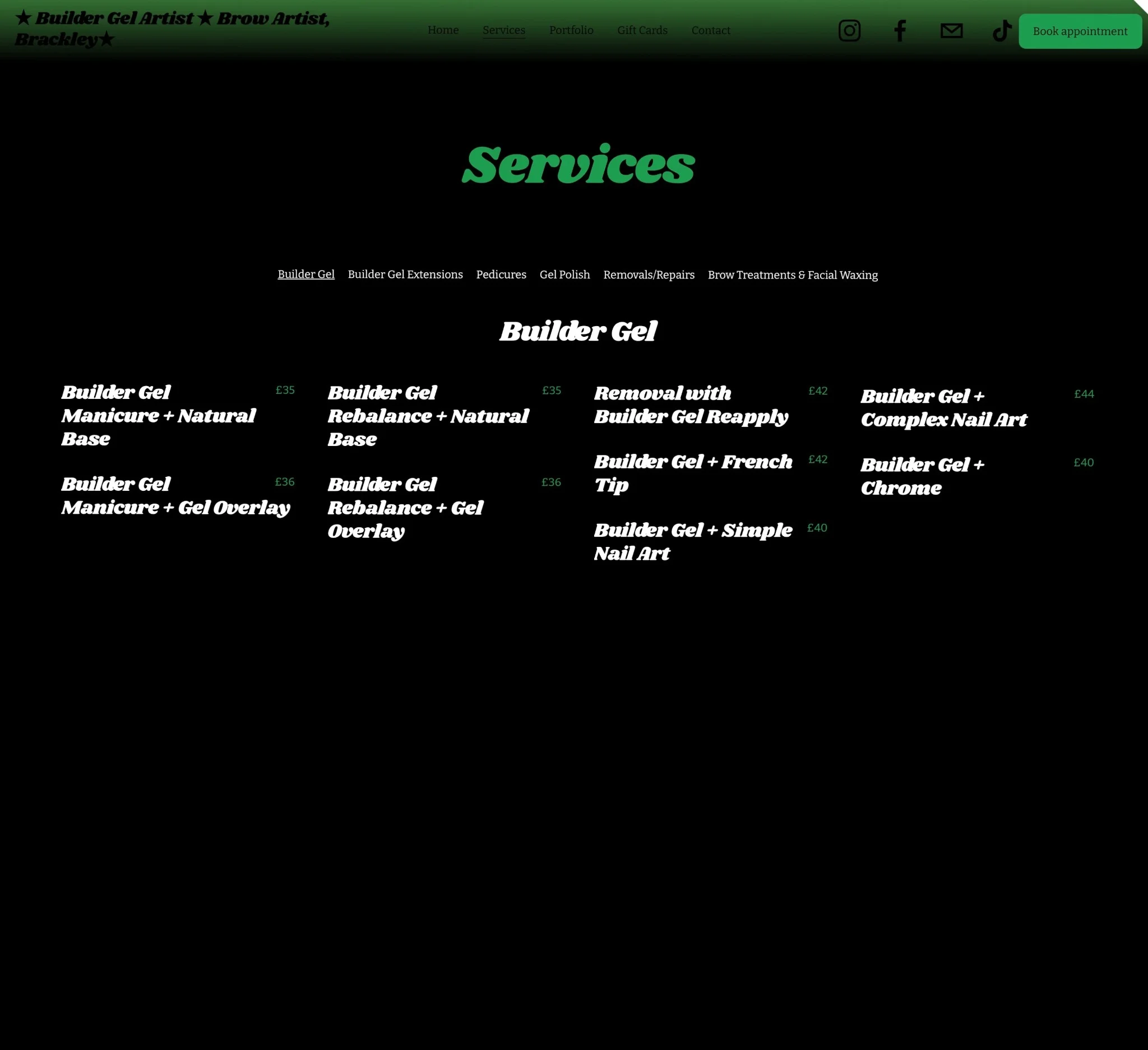
Before: Flat list of services. Only way to book was through the nav.
After: Services grouped by category with booking buttons inline. One tap to book from any treatment.
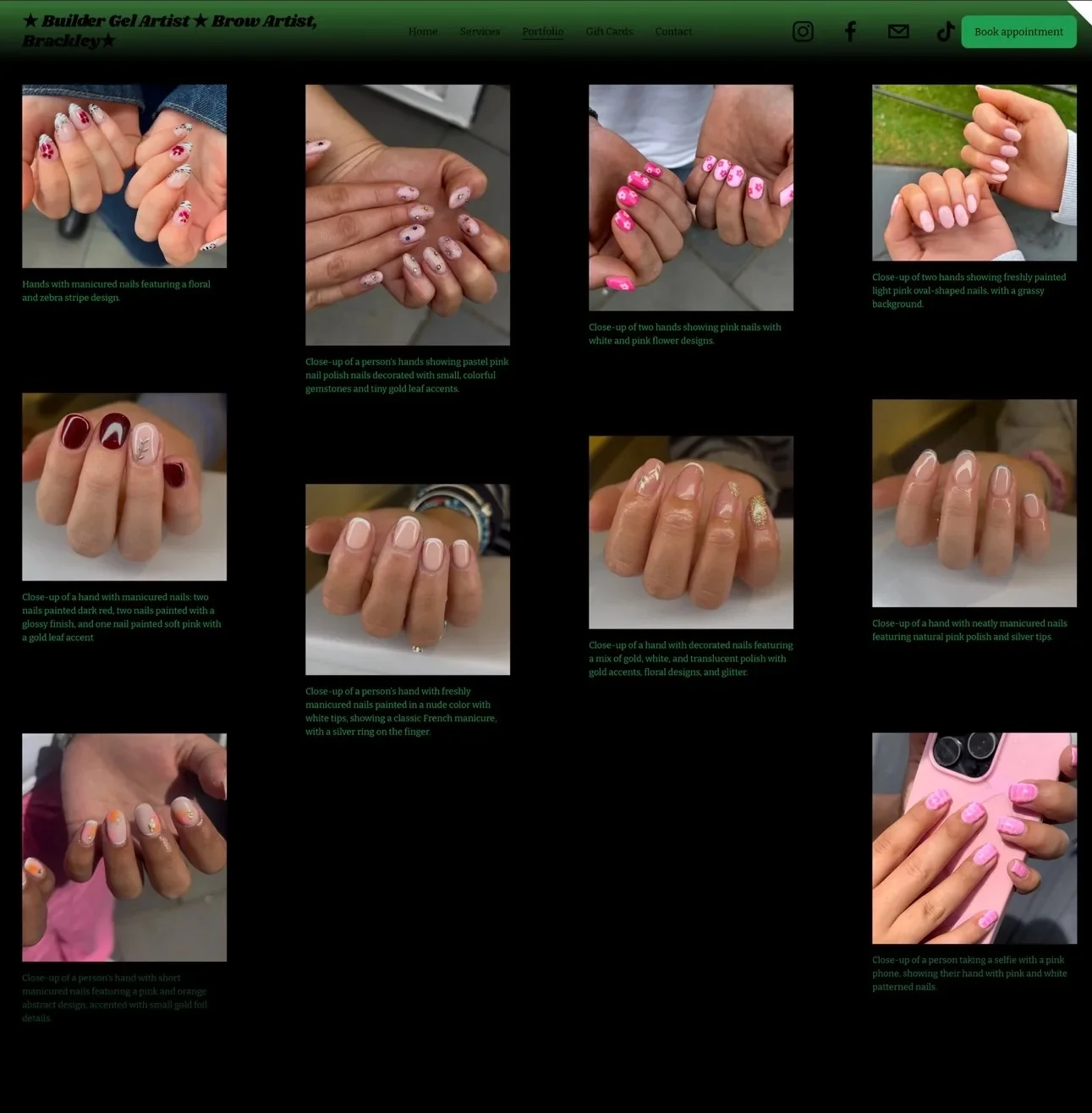
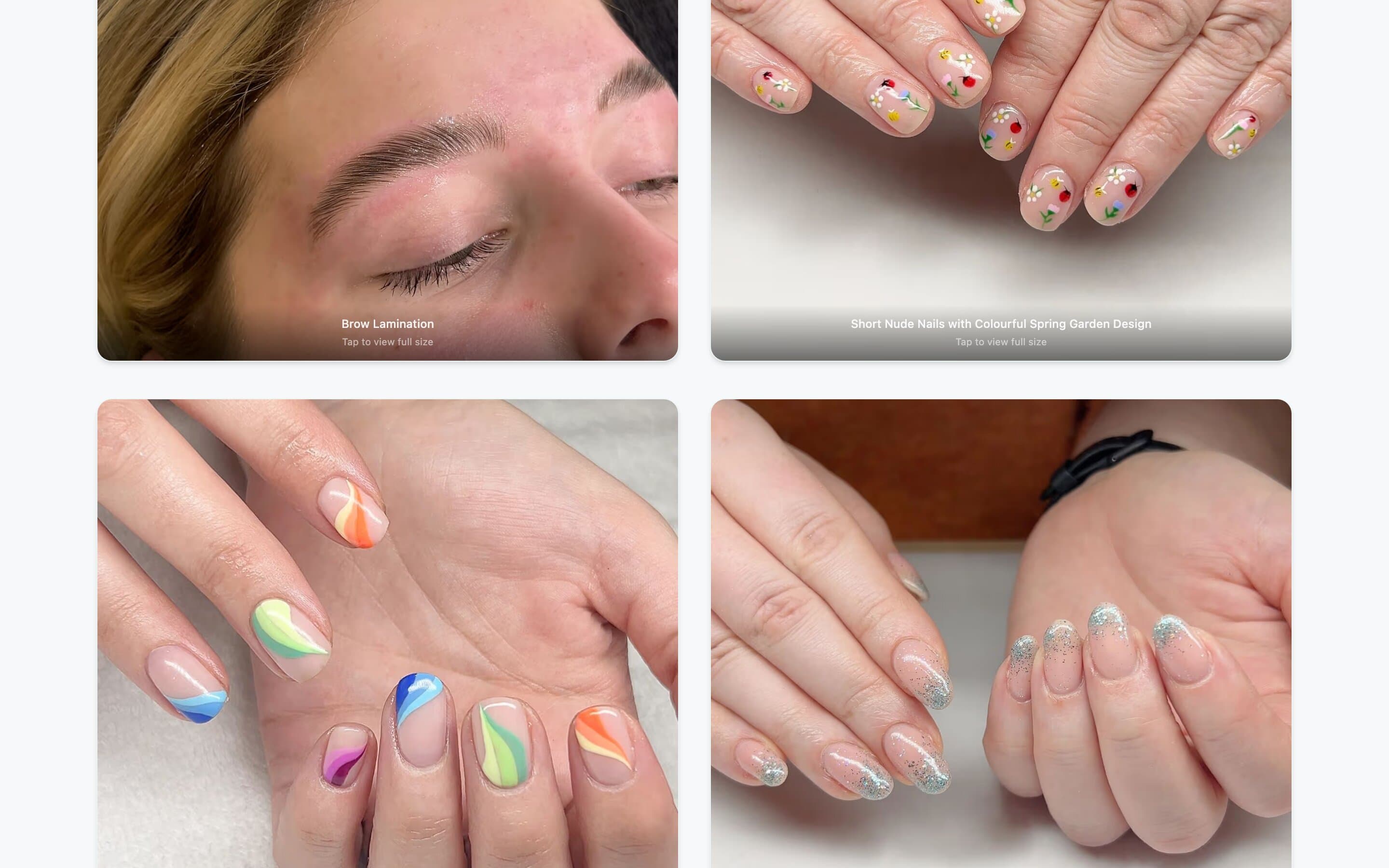
Before: Just a grid of photos. No context, no next step.
After: Gallery with captions tied to services, and booking prompts after the proof.
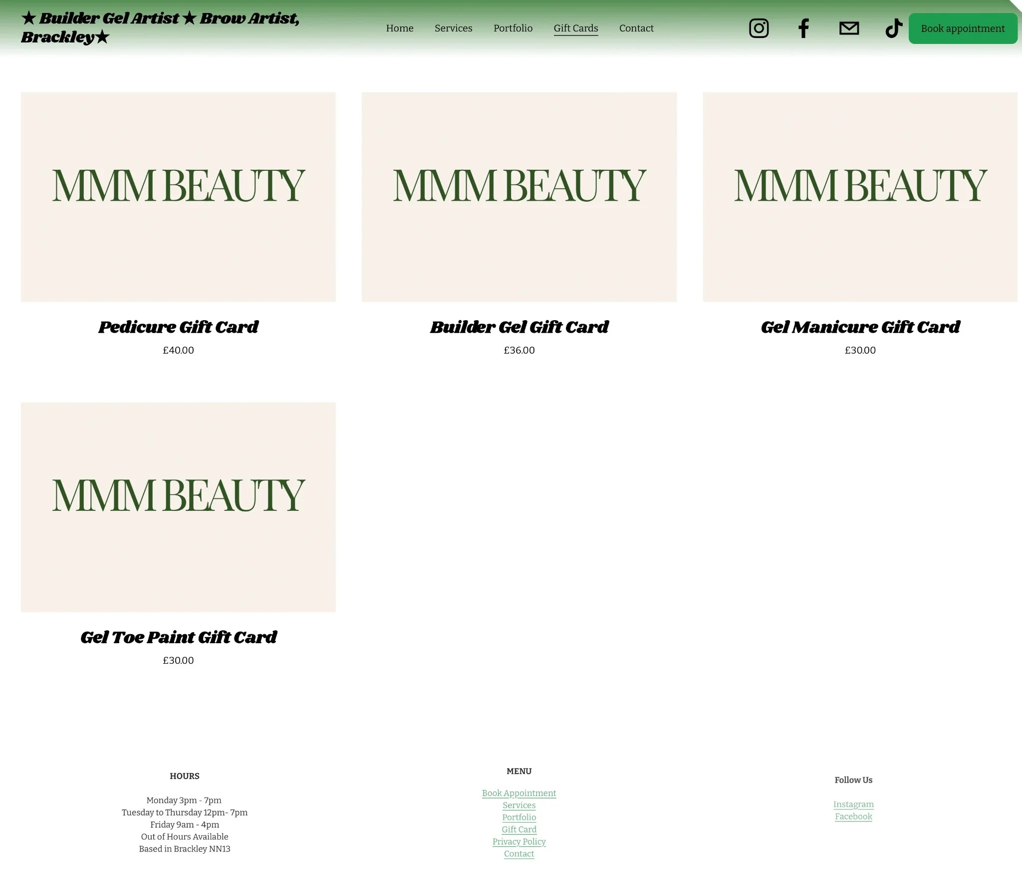
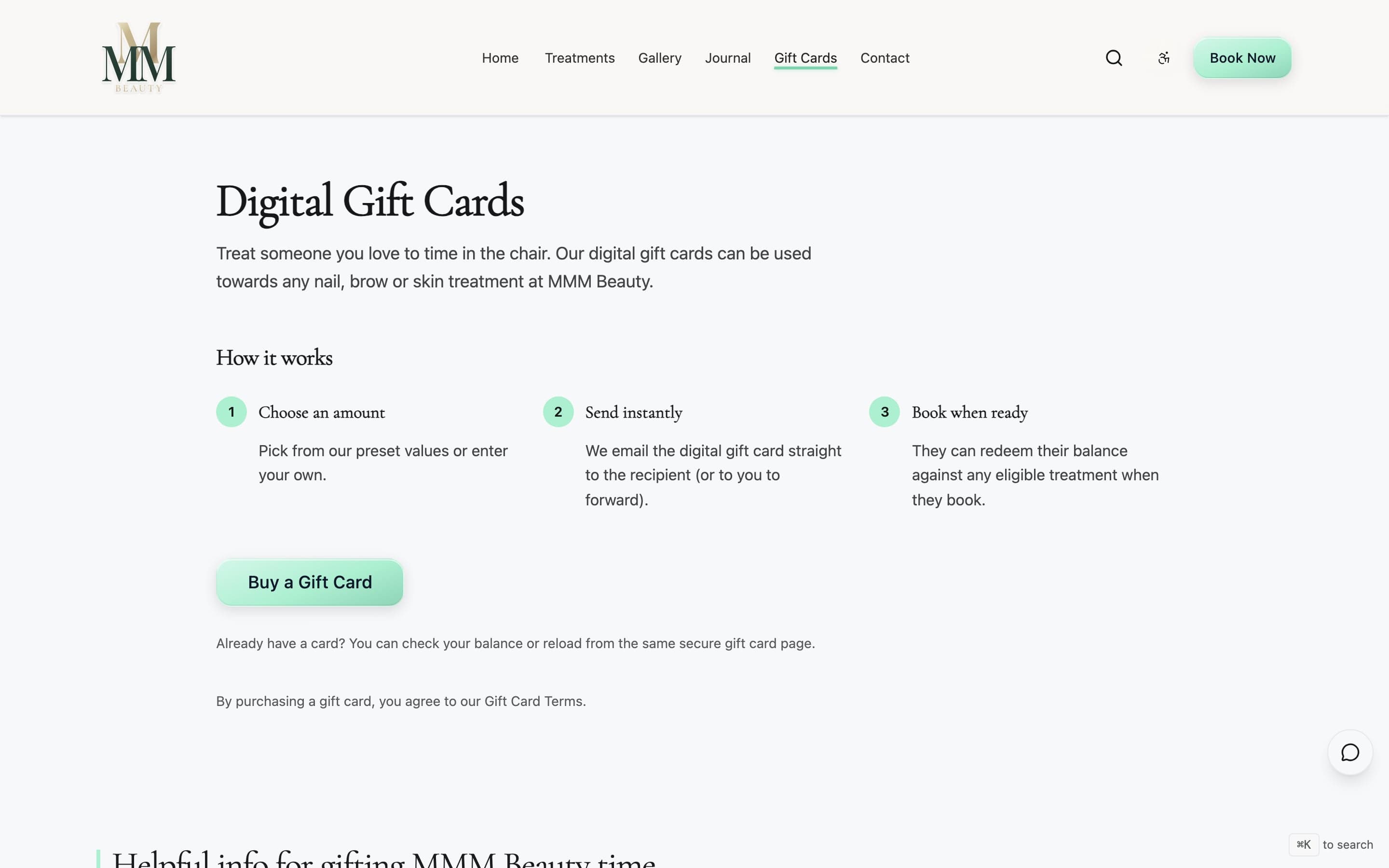
Before: Gift cards mentioned but the purchase path was unclear.
After: Dedicated page with pricing, a clear buy button, and gifting occasions.
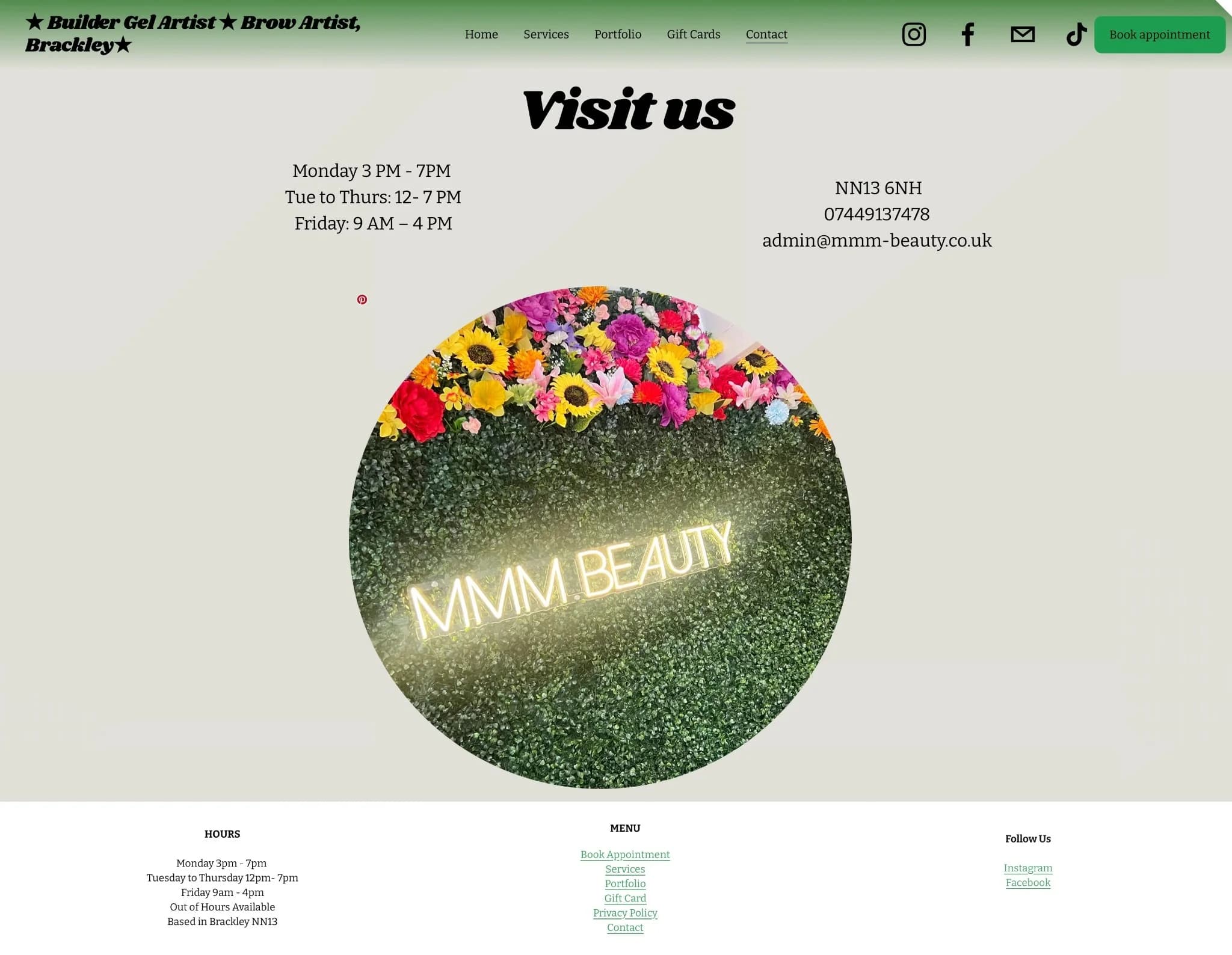
Before: Generic form. No distinction between someone ready to book and someone just browsing.
After: Booking button as the main action, form as the backup for questions.
If your business is good but your site isn't pulling its weight, we can fix that.
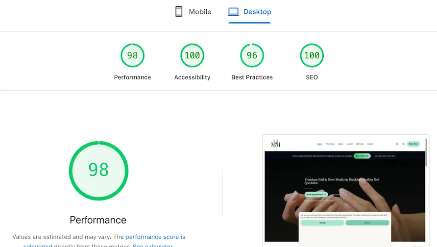
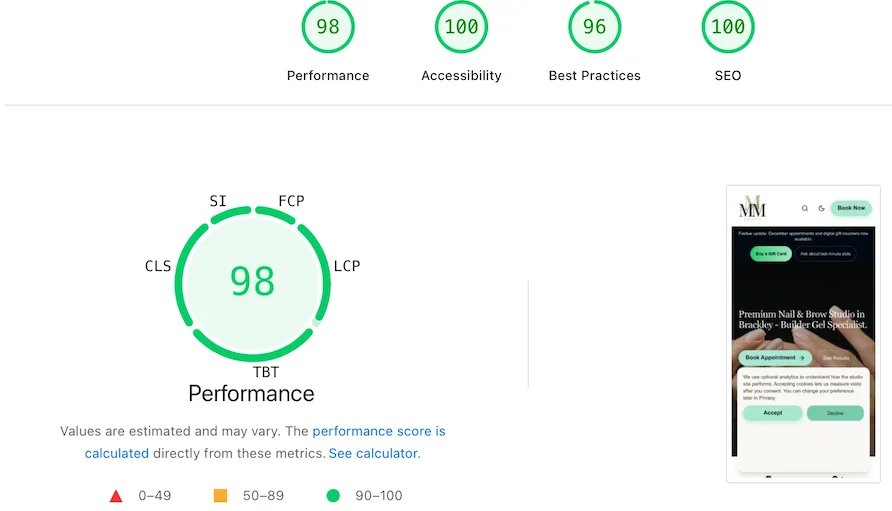
Desktop scores: 97 Performance, 100 Accessibility, 100 SEO. Mobile: 82 Performance, 98 Accessibility, 100 SEO.
CI quality gates per deploy
7
Routes with automated checks
12+
Critical a11y violations at launch
0
Structured data coverage
All commercial routes
These checks run automatically on every deploy so quality stays consistent over time.
What we used and why.
Online bookings became the default path instead of the back-up. Meghan saw more bookings come through the site, with less time spent answering booking requests in DMs. The booking flow on mobile became cleaner, and the new design matched the premium feel of the studio itself.
The operational shift was the bigger story for the day-to-day: less manual admin, fewer back-and-forth message threads, and a clearer hand-off between browsing and booking. The site now does more of the booking work automatically.
The softer outcome matters too. The site looks and feels as premium as the studio, which reinforces trust before a customer ever books. For a business like MMM Beauty, that perception shift supports better-fit enquiries and stronger pricing confidence over time.
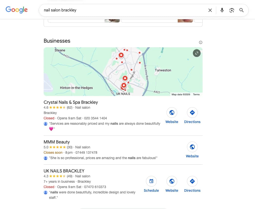
Since the relaunch, organic search has grown from a near-standing start into a compounding discovery channel. Comparing the first full month of data with the most recent, monthly impressions in Google rose +838% and clicks rose +196%, with the run-rate still climbing. The site owns its brand at the top of page one and now ranks on page one for its core local-commercial terms.
MMM Beauty also ranks in Google's local map pack for "nail salon Brackley" with a 5.0 rating, above competitors with twice as many reviews, and appears in AI-generated recommendations for Brackley nail salons, cited directly from the site's own content. That AI citation is the payoff of Generative Engine Optimisation (GEO): structured local SEO, areas-we-serve pages, and content built to be quoted by AI answer engines like ChatGPT, Perplexity, and Gemini, not just ranked on Google.
Organic impressions (Jan–May 2026)
+838%
Organic clicks (Jan–May 2026)
+196%
Brand search CTR (avg position 1.9)
31.9%
Core "Brackley" search terms
Page one
Source: Google Search Console (sc-domain:mmm-beauty.co.uk). Growth compares the first full month (Jan 2026) with the most recent full month (May 2026); brand CTR and rankings are period averages, 6 Dec 2025 – 21 Jun 2026.
“More bookings come through online now, I'm not stuck in DMs all day, and clients have commented on how professional the site looks.”
“D'mitri helped our Brackley nail studio move from Squarespace + Acuity to a better setup (website + Square Appointments). More bookings come through online now, I'm not stuck in DMs all day, and clients have commented on how professional the site looks. He's also helped loads with marketing/positioning and SEO and we've had more consistent weeks since. Highly recommend.”
If this project were being run again, the one thing worth pushing even earlier would be the content and positioning workshop. The booking and visual improvements landed strongly, but capturing more of the service language up front would have created even more room for the SEO and messaging gains that followed.
If your site is not pulling its weight on bookings, enquiries, or credibility, get in touch and we will show you exactly what is getting in the way.