Site preview
Case Study · Wellness
A production website for a guided journal for women healing from trauma: calm aesthetics, accessibility-minded UX, and a low-pressure path to stay connected.
Site preview
Brand fit
Feels like the journal it represents
Buyer experience
Calm, low-pressure, mobile-first
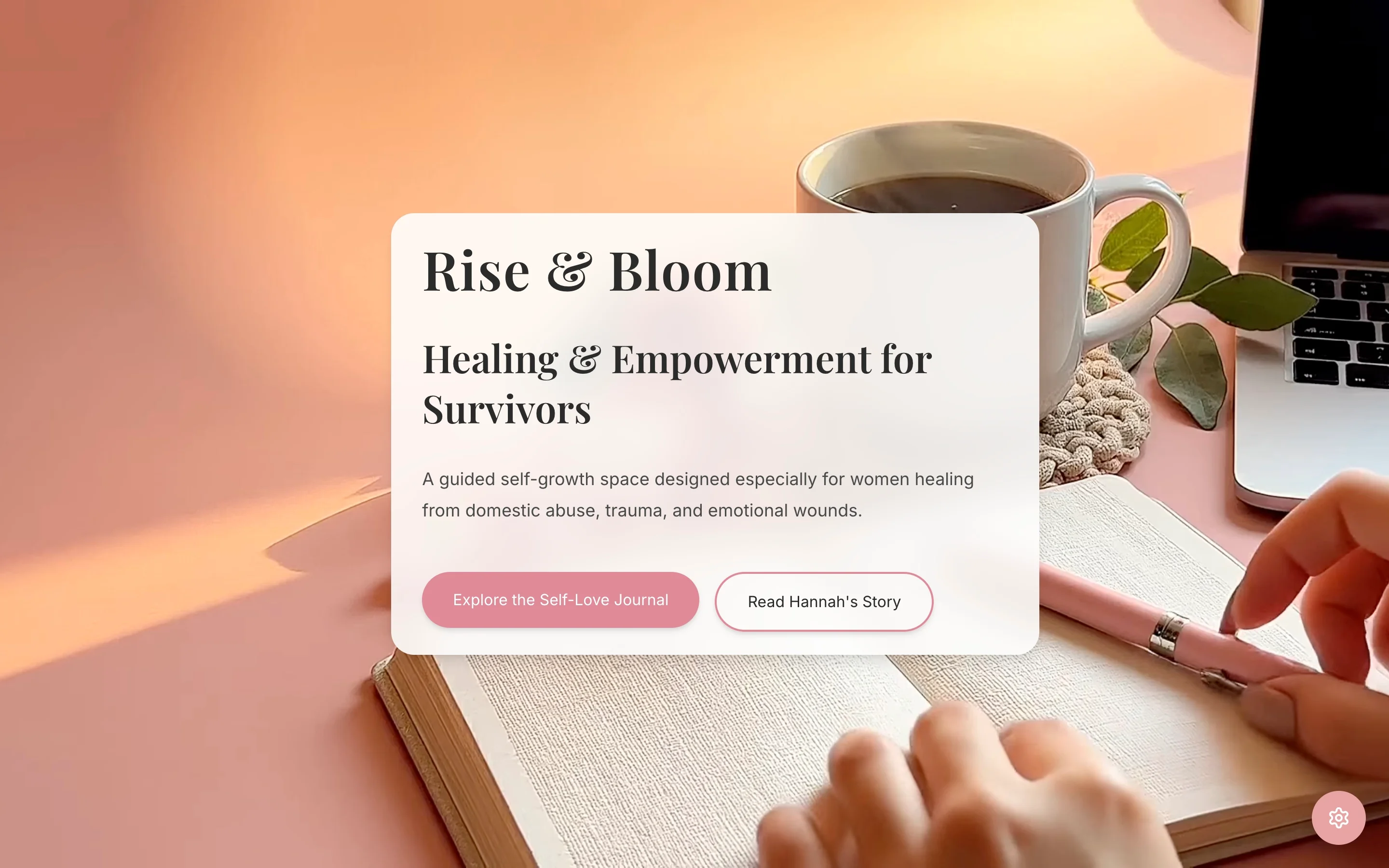
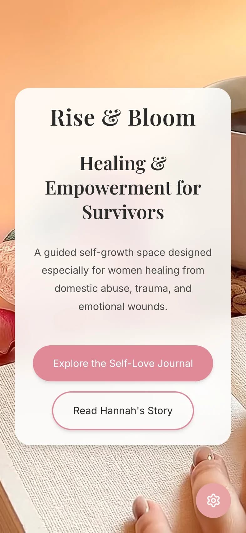
Rise and Bloom is a guided self-growth journal created by founder Hannah Kelly for women healing from domestic abuse, trauma, and emotional wounds. When Hannah approached Doman Digital, she had a clear brand vision and a Figma design concept but no production website. The ask was to bring that vision to life as a real, working site, one that felt as considered and safe as the product itself.
This was not a typical web build. The audience for Rise and Bloom is not browsing casually. The people who find this site are often in sensitive periods of their lives. A site that felt clinical, aggressive, or confusing would not just underperform. It would actively undermine the trust the product depends on.
The challenge was not technical. It was tonal. Most website conventions, bold hero copy, high-contrast urgency, prominent pricing, aggressive calls to action, are calibrated for buyers who are evaluating options from a position of security. They do not translate well to an audience that may be approaching with fragility, uncertainty, or fear.
Getting the tone wrong for a wellness journal aimed at trauma survivors would not show up as a bad bounce rate. It would show up as a product that people encountered, felt was not for them, and quietly left. The brand Hannah had built deserved a digital expression that matched its care. Building something technically functional but emotionally off would have been a failure regardless of the Lighthouse scores.
The second challenge was accessibility in its fullest sense. The audience for Rise and Bloom skews toward mobile, may include users with reading difficulties, and may prefer lower stimulation environments. Standard accessibility compliance, contrast ratios and tab order, was a floor, not a ceiling.
The design system was built around calm rather than conversion. The brand palette uses soft blush, dusty rose, lavender, cream, sage, gold, and peach. Typography pairs Playfair Display for expressive headings with Inter for legible body copy. Spacing is generous. Rounded cards replace sharp edges. Gradients replace flat blocks.
Every section of the site was sequenced around the emotional journey of someone discovering the journal for the first time: who this is for, what it does, who made it and why, how to take the first step. The hierarchy moves from reassurance to explanation to belonging to action, in that order, because that is the order a hesitant visitor actually needs.
A video hero creates warmth and presence from the first second of a visit. Poster fallback ensures the first frame is intentional, not a blank screen. Reduced-motion handling ensures the video disappears completely for users who prefer less stimulation, replaced cleanly by the static poster image.
The contact path is a newsletter signup, low commitment, no payment friction, no pressure. The conversion architecture matches the trust level of someone at the early stage of their healing journey.
The site runs on Next.js 14 with the App Router, TypeScript, Tailwind CSS, and shadcn-style Radix components, hosted on Vercel with GitHub Actions CI for lint, typecheck, and build validation. Pages are statically prerendered for fast load times on mobile connections. SEO foundations cover metadata, Open Graph, sitemap, and robots.
The most distinctive technical decision was the Experience Settings panel: a persistent user preference layer giving visitors control over Focus Mode, a dyslexia-friendly font, and dark or light theme. Preferences persist to local storage so the site remembers what each visitor chose. This is not a tokenistic accessibility feature. It is a deliberate acknowledgement that the people using this site may have different needs on different days, and that control matters.
Mobile was treated as the primary surface throughout. Touch targets are a minimum 44px, safe-area positioning accounts for notched phones, and input sizing prevents iOS zoom on form focus. These are the details that most sites skip and that most users of this site would notice if they were missing.
Lighthouse scores on desktop (measured via crawlshot): 100 performance, 100 accessibility, 100 best practices, 100 SEO.
The site now matches the care and intentionality of the journal it represents. Hannah's own words from her review: "Doman Digital took our ideas and turned them into a website that actually feels like our brand. We needed something calm, clear, and easy for people to use on their phones. They got the tone right and made the site feel much more intentional."
The softer outcome is harder to quantify but equally real. For a product whose entire value proposition is emotional safety and intentional growth, the alignment between brand and digital experience is not cosmetic. It is the product. People arrive, feel the site is for them, stay, and choose to stay connected.
Next.js 14, TypeScript, Tailwind CSS, Radix UI, Vercel, statically prerendered, Experience Settings with focus mode and dyslexia font, reduced-motion hero video, Lighthouse (crawlshot): 100 / 100 / 100 / 100
“They got the tone right and made the site feel much more intentional. Feedback from our audience has been really positive since launch.”
“Doman Digital took our ideas and turned them into a website that actually feels like our brand. We needed something calm, clear, and easy for people to use on their phones. They got the tone right and made the site feel much more intentional. Feedback from our audience has been really positive since launch. Super collaborative and easy to work with.”
Reviewed publicly on Google as Shinika Kelly.
If this project were running again, I would push for a dedicated resources or tools page earlier in the build. The journal has a genuine content offering around self-growth frameworks and healing practices. A resources section would have created more organic search entry points and given the newsletter signup additional context. The architecture exists to add it, but building it into the initial scope would have accelerated the SEO side of the project.
If your audience needs calm, clear structure rather than hard-sell conversion patterns, we can map the right journey and build it properly on mobile. Start by getting in touch, or book the Website Audit if you want a paid diagnostic first.